Sep 10, 2018
Visual Elements: Prioritizing your Package Design
Have you ever bought an item at the grocery store only to get home and realize you bought crushed tomatoes instead of tomato sauce? How about the “sweet” version of BBQ sauce instead of “spicy”? Non-fat vs Original? It happens all the time, and it’s never a pleasant experience. However, by using the correct hierarchy in your packaging design, you can help consumers avoid these mistakes and cultivate a relationship that may lead to a brand-loyal customer.
Visual Elements: Design Against the Consumer’s Attitudes
Let’s start with what consumers want to know when they grocery shop:
- What is the [specific] product?
- What is the brand?
- Everything else (ingredients, brand promise, nutrition call-outs, etc.)
Numbers one and two have a little lee-way in hierarchy depending on your product. If you are selling just one product or two products that are clearly different (such as bacon vs pork tenderloin), then perhaps brand should be number one. However, if you are selling a line of products whose only difference is flavor (like BBQ sauce or ice cream toppings), then the specific product should really trump brand. Otherwise, your customers may end up with the mix-ups mentioned above.
 Visual Elements in Practice
Let’s take a look at the examples below:
In the Hunt’s example, you can see where the brand is clearly #1 in hierarchy, and the actual product gets a little lost. Most consumers don’t want to be in the grocery store for hours. They want to find what they need quickly and get home to their families and busy lives. The Hunt’s products look so similar that you can see the situation develop where, if someone wasn’t paying close attention, they may grab the wrong item. Briannas Home Style Dressings packaging, however, is a great example of how to communicate the specific flavor of dressing while keeping the brand front-and-center as well.
Let’s see two more examples:
Here, The Food Doctor logo takes up 80% of the packaging. The color-coding of the packages is helpful, but the first and third items are both “bulgar wheat & quinoa.” You can’t even tell the difference between the two until you read the last line, which is the smallest item on the front of the packaging, making it the lowest-ranked item in the packaging hierarchy. Even the packaging weight is more prominent than the flavor! Combine that with the fact that the only visual on the packaging is an apple and that none of these products contain apple or apple flavoring, and you have yourself a confusing mess.
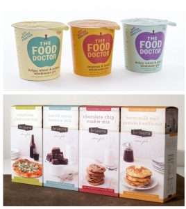
The Briaura brand does a really good job of keeping their brand identity very clear, while also making it very obvious what type of mix you’re putting in your cart. In addition to a color-coded system, it uses mouth-watering imagery as well as a large title at the top of the packaging.
Visual Differentiation
When creating packaging design, it’s also important to keep in mind that branding is more than just a logo. As mentioned above, you may not have this brand vs product-recognition hierarchy problem if you only have one product. If that’s the case, your packaging has to work harder to stand out on the shelf. More than likely, it takes up less shelf space than those with full product lines. Although only a concept, the packaging for Spine Vodka is a great example. The brand minimizes the actual logo while still standing out on the shelf.
Ready to Design?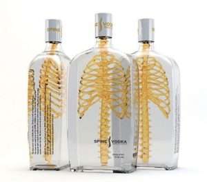
Thus, to maximize your brand visibility, we are always happy to work with you at NewPoint Marketing on hierarchy in your package design.