Jun 20, 2017
Does your product packaging anticipate consumer needs?
It’s a market-driven world.
Products are bought, not sold…especially at places like the grocery or convenience store shelf where customers confront your packaging head on. And since there’s no salesperson standing there on your behalf, your packaging is going to have to do all the talking.
In these moments, your packaging needs to be about:
- Creating and building brand image;
- Visually separating your product from others on the shelf (i.e. “standing out”);
- Helping the consumer make a purchase decision.
We’re going to focus on #3 for now.
Sometimes the buying decision comes down to ingredients or nutrition facts or other points that differentiate what’s inside from other options on the shelf.
But sometimes it’s about differentiating from yourself.
Picture this:
I’m in the middle of making dinner and realize that because my husband someone put the jar that used to contain BBQ sauce back in the refrigerator (empty!), I now have no BBQ sauce for the recipe I’m making. Off goes hubby someone to the grocery store.
Fifteen minutes later he returns with the BBQ sauce. The wrong BBQ sauce. He gets an eye roll from me, but I use it anyway and move on with dinner. The dish turns out to be a little more “Sticky Sweet” than “Original”, but it’s not all his fault. Stubb’s gets some blame too.
 And Stubb’s should care.
Because when a shopper’s confusion about your packaging turns into frustration, it’s a drag on your brand.
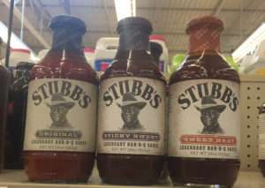
Let’s look at what Stubb’s has done right as well as where it can still improve.
Overall, I love this packaging. (That may or may not have something to do with why we buy this brand.) Its clean without being boring, has a simple yet authentic feel, and I can spot it right away on the shelf.
But there is one pitfall to this packaging that is pretty obvious. The labels for the various flavors are not different enough for a distracted mom or absentminded dad to notice. The “Sweet Heat” flavor is a little more pronounced (Thank goodness!) but the difference between “Original” and “Sticky Sweet” is so subtle that even the most cautious of shoppers could mistake the two–not that I’m calling my husband someone cautious. Stubb’s tried to use color to differentiate flavors, but didn’t do it enough.
On the other hand, here are a few of Stubb’s competitors hitting the mark, like hak’s and Heinz. Notice how the different color for each flavor permeates the label. Their labels keep a consistent brand-feel while also helping consumers easily differentiate between flavors and making a purchase decision.


Need help with your packaging? Ask NewPoint for a consultation!