Jul 5, 2017
How does your website stack up : Design
Why is web design important? A well-designed website presents your brand as well-established, relevant, and, if done properly, a brand that consumers can relate to. This is particularly important if your target-market is millenials, who are on the web constantly.
Aside from aesthetics, web design also includes user experience. Is your design coming off as too sales-y? Is your website easy to navigate? Does it include all of the information your visitor is looking for?
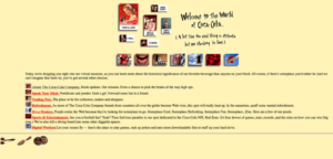
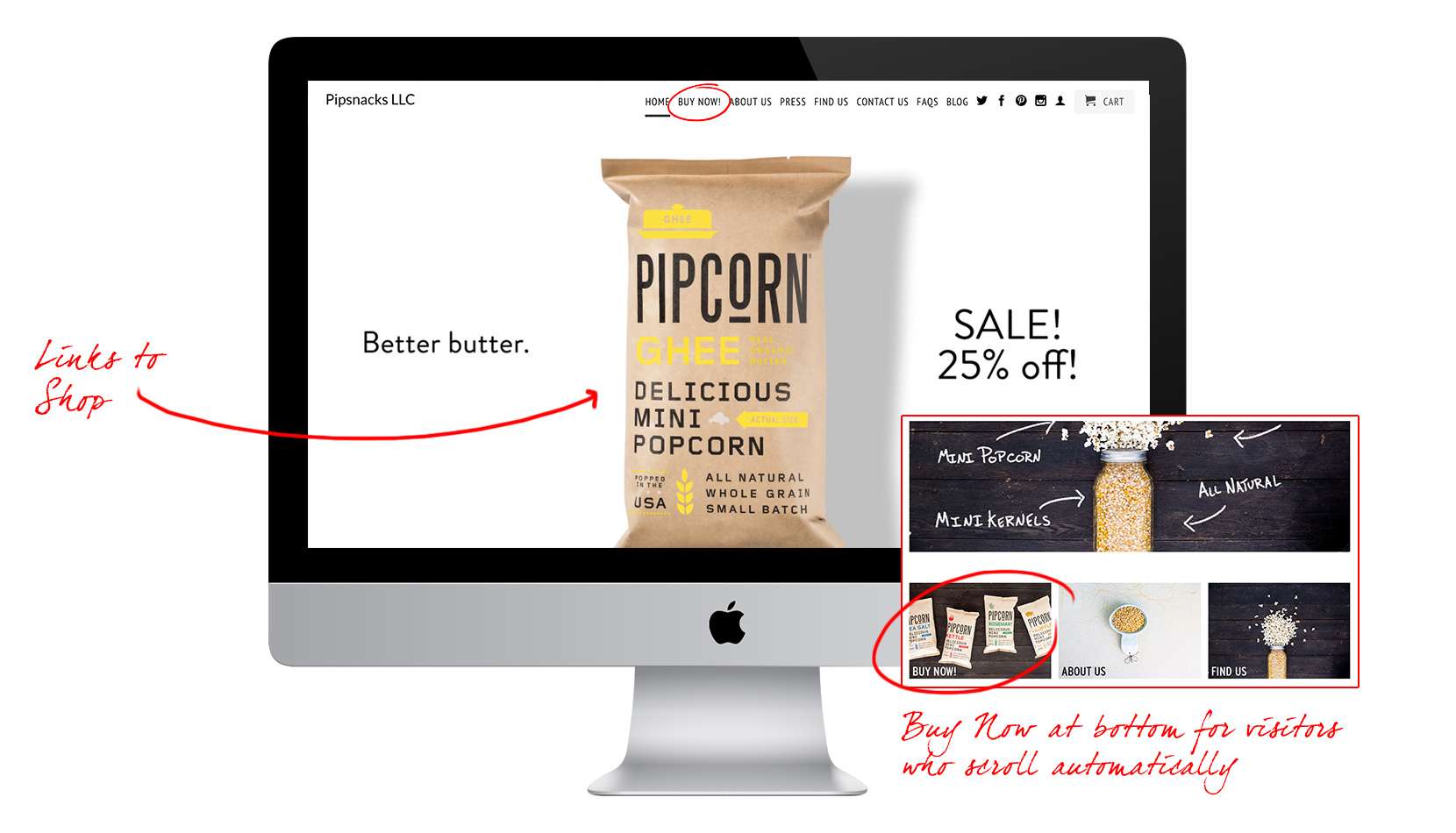
If you’re wondering if it’s your website design that is holding consumers back from purchasing your products online, PipSnacks.com is a great site to use as a comparative resource. They do everything right. Click on the buttons below to see what you can do to enhance your web design and motivate visitors to buy.
Keep It Simple Help Them Help You Don’t Force It How Do You Stack Up?
Be sure that your website design is clean, packaging is front and center, quickly and easily displays multiple products
- Notice the lack of clutter on these homepages.
- Visual. Headline. Simple Navigation. Done.
- Don’t fall into the “Above the Fold” myth that visitors won’t see anything that they have to scroll to see. Unless your website looks like the one on the right, people WILL scroll to learn more about your product. They visited for a reason, after all.
- Consumers want to know what they are purchasing. Packaging design is the first thing visitors should see.
- You’ll notice that the packaging and website design go hand-in-hand; work seamlessly together in these examples.
- The ” simple to differentiate between products” category should be carried through to the Buy Now page as well, where it really counts, to make purchasing shopper-friendly. The easier it is to tell what is available, the more consumers are likely to buy. Plus, you don’t want to put shoppers in the position to accidentally buy the wrong product.
- Note: In most cases, clean packaging design helps the website design, so if your packaging is in need of a re-vamp, now may be a good time to start thinking about that.
Be sure to make it easy for your visitors to shop.
- Homepage should contain and obvious “buy now” button in the navigation, where they are expecting/looking for it.
- Main visuals also typically link to the shop.
- Additional links to the shop page should be at the bottom for visitors who are inclined to automatically scroll.
Push to purchase should not feel forced.
- Please, no giant, in-your-face, “BUY NOW!” blasters or ticking countdown clock to purchase in the next XX minutes and get XX% off. These feel spammy, and a lot of scam wesbites use these tactics. This is a good way to ruin brand trust fast.
- Consider offering different promotional strategies to buyers who are motivated by different types of saving strategies:
- Perhaps a 25% off sale that is upfront and legible, but doesn’t overwhelm the page. Be sure it is a balanced and well-thought element to the design, rather than the main headline.
- Another idea is to promote new varieties, flavors, and highlight unique facts about your product.
- Or use a free shipping over $XX to encourage consumers to buy multiple to receive free shipping.
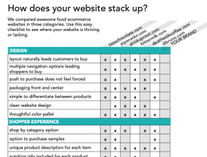
Download the PDF to see how your website stacks up to some of the best-designed food e-commerce websites out there. Where can you improve?


If you have any questions or would like to learn more about this topic, please reach out to the NewPoint team. If you are interested in more food marketing topics, please visit our “Intel” page or check out my (NewPoint’s Patrick Nycz’s) book: Moving Your Brand Up the Food Chain.