Jan 28, 2021
The Wright Way to Redesign Your Brand Packaging
We can all take some inspiration from the beautiful job the folks at Wright® did when redesigning the brand packaging for their 1.5lb bacon stack pack.
This is brand packaging redesign done right.

Subtle upgrades that elevate the brand into the modern era—but not too drastic of a change that they lose their audience. You don’t want to go so crazy that you leave your loyal fans wondering “Where did my favorite bacon go?”
the LOGO:
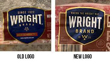
A new, modern face-lift has been given to the logo. They kept the strong (recognizable) structure of the old logo such as the bold blue color, the golden outline, and the commanding white letters. But, the new gold has a fresher feel to it. The old, shiny gold dated the brand. This new creamy matte gold is very modern but still gives a nod to the brand’s classic, established position in the marketplace.
They ditched the gold outline around the Wright lettering and opted for a more simplified look with just the bold white lettering—while still keeping that recognizable ‘Wright’ font style.
The rest of the changes in all the details within the structure of the logo have all been simplified for easier readability and a more clean look.
the MAIN LABEL:
So. Much. Better. Here are the highlights:
A lighter, brighter brown coloring with nice blending contrast on the bacon backdrop. This blending lets the rest of the elements on the brand label really stand out.
The striking “Real Wood Smoked” lettering with the wood-textured font. . . Brilliant! They kept all the basic elements that were included on the original label but stacked them in such a way that allows room for larger wording.
They created a graphic to house the flavor, thick-cut, and weight of the product all in one place. Love this! It is much nicer than the original text used as a font, separate from the weight graphic.
I love how they elevated this brand packaging into the modern era and still kept their established brand feel. Nixing the shiny gold outline and replacing it with the matte gold was a win in my opinion. The shiny metallic made it look dated. The overall label has a subtle matte ‘sheen’ to it, and it is beautiful! This technique also helps combat that nasty glare you sometimes see on labels from the harsh grocery lighting. Bonus points!
This brand packaging upgrade makes my heart sing! I love when companies invest in making their brands better—recognizing the need for change and implementing it with classic perfection. I will say, I do buy this bacon—and when I saw it from across the way, I giggled with excitement when I saw this new brand packaging (on the inside, of course. . . didn’t want people to think I was a weirdo!). And I was happy to see that it was just as recognizable as before—but better.
Final Thoughts
This wouldn’t really be a proper brand packaging evaluation if I didn’t have something negative to say—it can’t all be perfect, right? Well although it is pretty close, I do have one grievance. I’m not crazy about the placement of the UPC on the new design. It allowed good things to happen on the right side of the label, but it is so close to the logo and it crowds it. I did like the way the logo was allowed to shine all by itself in the old version. It’s one of those details that you have to have on your packaging that drives a designer crazy. I know, I’ve been there.
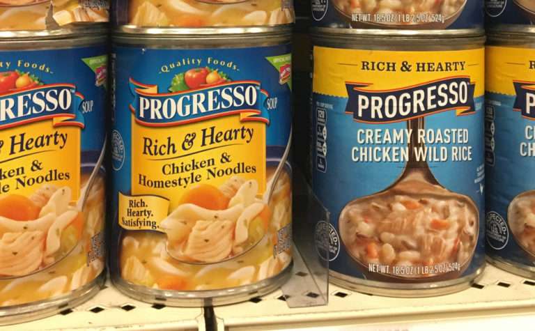
Want to read about a not-so-hot package redesign (IMHO), go to my blog on Progresso Soups.
If you have any questions or would like to learn more about our food marketing firm, please reach out to the NewPoint team. Interested in more food brand marketing topics?—please visit our Food for Thought page or check out NewPoint’s Patrick Nycz’s book: Moving Your Brand Up the Food Chain.
