Jun 15, 2021
2020 Food Packaging Rebrand Review Part 2
Round 2 of 3 of the 2020 food packaging rebrand review, opinions courtesy of your NewPoint Marketing Team, and Newhope photos are curated. If you haven’t already, you might be interested in reading part 1.
As a quick reminder, I formulated my opinion and sent the article to our art director, Kristy, to get her opinion separate from mine. And, just for good measure, we had our Marketing Coordinator chime in for a non-designer perspective. We’d love to hear if you agree or disagree with our feelings on the design. Let’s get started.
Chef’s Cut
Ashley M-Designer
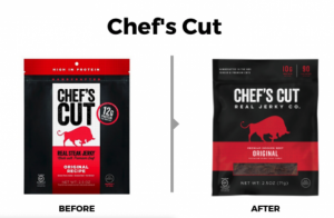
My first thought is that I don’t know why they bothered with a packaging rebrand “redesign,” as this is essentially the same packaging. Same look-feel, same hierarchy, same colors, etc. I’m really hoping that the only reason for the change is that they had new capabilities to include the clear window, which of course, you know by now I’m highly in favor of.
Kristy B-Art Director
First thought: Lovely.
Both of these are great. Not sure an update was necessary, but I do love it! The addition of the see-thru panel is a very nice touch!
Ashley B-Marketing Generalist
I actually like the original packaging on this one. The vertical bar is appealing to break things up. I also like the circle protein call-out.
Chosen Foods
Ashley M-Designer
In the case of both designs: My mom taught me if I didn’t have anything nice to say, best not to say anything at all.
Kristy B-Art Director
First thought: yes!
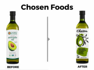
Although the old design reads ‘avocado’ more prominently than the new one…you will never see me pick illustrated realism over clean, modern, abstract elegance. Love it! Bonus—the new Chosen Foods logo is worlds better than the previous one.
Ashley B-Marketing Generalist
I almost feel like the new package is trying too hard. I am not a huge fan of the font. It looks pretty busy for such a slim label. I think “before” has a more simplistic feel which seems to go better with healthy or natural.
CleanWell

Ashley M-Designer
While not a significant change, this redesign elevates this packaging from feeling like a generic store brand to a trusted brand. It is simplified, has a clear hierarchy of information, and is straightforward. The new design feels fresh and clean, matching the name and product.
Kristy B-Art Director
First thought: Much better.
I see this as a subtle upgrade with a big impact. Much more clean and simplified. They ‘dumbed-it-down’ but in a good way.
Ashley B-Marketing Generalist
I think the new packaging looks better here. I like the consistent green color versus the different shades on the previous package.
Cocomels

Ashley M-Designer
This would probably be my favorite redesign so far if it weren’t for REMOVING the see-through part of the packaging. Tisk, tisk. Other than that, this redesign provided a much-needed update while staying true to the brand.
Kristy B-Art Director
First thought: Yes! Better.
They kept the good stuff from the old design and made it all better. Much better. The new packaging is a more settled-down design. Elegant and clean for the win. …I don’t even miss the see-thru package detail, which is/was a nice touch.
Ashley B-Marketing Generalist
Definitely feeling the news. I think there are too many geometric shapes on “before.” The new look seems a lot cleaner, and I think the addition of showing the actual candy piece is nice.
Ethan’s

Ashley M-Designer
Maybe it’s just me, but this feels like another bored designer moving couches. The “after” versions aren’t better; it’s not worse, it’s just like… why? It DOES call out “Daily Detox,” but even at that, it still leaves me with questions. What does “daily detox” mean? If you didn’t know what this product was before, I don’t think that phrase eliminates any confusion. The “before” packaging isn’t bad, but the new feels like a lateral move.
Kristy B-Art Director
First thought: No.
Another “was it necessary?” update. Not crazy about the yellow label. At all. The pineapple is lost. Emphasis switched with the addition of some new wording. The words are easy to read with the black on yellow—but still not my favorite. The more I look, the proportions of the items in the new design are a nice balance. Now, though, the more I stare at it, the less I dislike it. Still not crazy about the yellow… I don’t think? That poor pineapple needs help. Maybe if it were black, I would feel better about this design update.
Ashley B-Marketing Generalist
I guess if I have to choose, the old one is better. You can barely see the pineapple on the new package. Yellow on yellow wouldn’t be my first choice. I also feel like this pineapple has a lot of hair?
HighKey
Ashley M-Designer
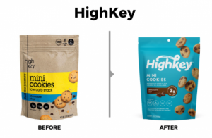
I don’t mind the “before” packaging, but ultimately l think the “after” is improved. It is a little more fun and playful, making me think “yummy cookies” first, and “oh, AND they are healthy?! This is a no-brainer!” second. The “before” gives off a little bit of an instant-oatmeal vibe, which is not nearly as fun or yummy.
Kristy B-Art Director
First thought: Yes!
Yes, to all. Color, photos, fonts, logo, composition… YES!! Just glorious.
Ashley B-Marketing Generalist
I am going with the new package on this one. On the old, the brand name doesn’t stand out, so that was an improvement. The cookies look a lot more appealing too.
So what do you think? Were these designs better, worse, or just keeping bored designers busy in 2020? Stick around for more packaging rebrand reviews.
If you have any questions about making your packaging rebrand awesome and your brand cohesive, please reach out to the NewPoint team. If you are interested in more food brand marketing topics, please visit our Food for Thought page or check out NewPoint’s Patrick Nycz’s book: Moving Your Brand Up the Food Chain.

