Aug 24, 2021
2020 food packaging rebrand review Part 3
,The third and final round of the 2020 food packaging rebrand review is here! Opinions courtesy of your NewPoint Marketing Team, and photos curated by Newhope. If you haven’t already, you might be interested in reading part 1 and part 2
As a quick reminder, I formulated my opinion, and sent the article on to art director, Kristy to get her opinion separate from mine. And, just for good measure, we had our Marketing Coordinator chime in for a non-designer perspective. We’d love to hear if you agree or disagree with our feelings on the design. Let’s get started.
34 Degrees
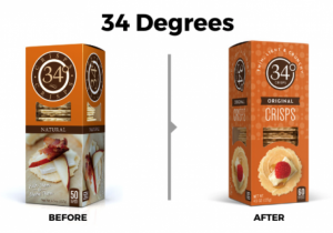
Ashley M-Designer
While these packages are pretty similar and I think that the “before” design is nice, I think the “after” is ultimately an upgrade. The simplicity of the logo and visual really helps to modernize it. If I had to make one change, I think I would remove the circle pattern in the background of the new design.
Kristy B-Art Director
First thought: So. Much. Better!
I love this! I love everything about this update. Everything. Money well spent. Bravo—so pretty! This is the best redesign (and packaging) in the bunch thus far. I could write a whole other blog about how pretty this is!
Ashley B-Marketing Coordinator
I’m digging the new package for this one. I like the window placement better on this one. I also think the picture of the actual cracker looks better as a top view versus a side.
Handsome Brook

Ashley M-Designer
Aye. There is a lot to unpack here. Let’s start with the logo. While the original isn’t great, I’m a little confused by what the new logo even is. Just “Handsome” in a typeface with whatever set of words they want to put under it? Also, the “before” packaging isn’t exactly modern, but at least it emotes a feeling of authenticity, a traditional brand I can trust. The “after” sooorta looks like they commissioned a class of second graders to come up with something. Yikes. Sorry, mom, I broke the “don’t say anything at all” rule.
Kristy B-Art Director
First thought: I dislike them both.
That’s all I got to say. If I had to pick one—the original. I guess.
Ashley B-Marketing Coordinator
Not going to lie, not a huge fan of either. The new one looks like something from the 70s and the old one- not a huge fan of the chicken on there. I’ll be honest that I buy the plain old egg cartons.
JoJo’s

Ashley M-Designer
“It’s a ‘no’ for me, dawg”. Here are all the “no”s: They’ve replaced the see-through packaging with a weird illustration of a woman that doesn’t help the user to understand the brand or product. They removed the nice, natural/healthy-vibe background texture for straight-up white. They removed all the prominent flavor descriptors & see-though packaging. Finally, they lost the nutrition call-out bubbles at the top. They. Just. Lost.
Kristy B-Art Director
First thought: Meh.
Just “Meh.” I guess the new packaging is better. It’s easier to read, more modern and youthful.
Ashley B-Marketing Coordinator
Can I go with the new but remove the lady? I feel like there is no point to having her on there. Maybe if she was actually eating? But even then, not sure. Elements I do like on the new package, the tan bar on the bottom, plain, white background, and the bolder brand letters.
KidFresh

Ashley M-Designer
I have mixed feelings about this one. Honestly, I think I like the kid-friendly feel of the “before” packaging best. I think the “after” feels a little too grown-up with a “health-meal” vibe. I don’t love the product image on the original design, but the image on the new design really just makes me want to go to the cereal aisle.
Kristy B-Art Director
First thought: Not necessary, but nice.
Old packaging was nice. New packaging is nice. There are good things about both designs. I think the old one feels a bit more kid-friendly but I do like the playful pattern addition in the new design (it saved the kid-friendly vibe a little).
Ashley B-Marketing Coordinator
I can’t really decide. I think having the kid on the old packaging might be better since they are trying to target that audience. Obviously, the adult is buying but I assume you get what I mean. To me, the new one looks better but also trying to consider the audience as well.
Runa

Ashley M-Designer
Like most of these, the “before” isn’t terrible, but the “after” is a cleaner, more modern versions. If I had to change one think about the new can, I would fit the flavor inside the color block. The half-in/half-out is driving me a little nuts.
Kristy B-Art Director
First thought: Both are nice.
The new design is better, as it is more modern and vibrant. Now that I see the change, I say “Yes” to the update—but, had I not seen the new one. . . would I think it needed a redesign? Probably not.
Ashley B-Marketing Coordinator
ooo this is fun. I like the new package! The colors really pop and I like the lighter, brighter green. The 10 calories callout at the top is nice, too. My guess is a lot of people would want this new can for Instagram worthy pics. Just saying.
Seal the Seasons

Ashley M-Designer
I love this redesign! It feels modern, natural, fresh, and authentic. It uses real photography in a modern way and the color scheme says “locally-grown strawberries” without even having to read the packaging. 10/10.
Kristy B-Art Director
First thought: Just Alright.
I am not super-excited about either, but, the new one is a good evolution. It feels more relevant and modern. The old design definitely feels dated. I don’t like the old packaging at all.
Ashley B-Marketing Coordinator
Again, going with new packaging on this one. The old one feels out dated. I like the more simple logo without all the colors. The new package picture pulls out “locally grown” better with the farmer on the tracker.
Simple Mills

Ashley M-Designer
I hate to end the blog on this one, but this redesign really just feels like another option from the same packaging concept. I really don’t prefer one over the other at all.
Kristy B-Art Director
First thought: Both are nice.
Good update to the composition hierarchy. That’s a win. Was an update really worth the money. . . not sure? Now, I do like the new one better, but. . . $$?
Ashley B-Marketing Coordinator
I like the old packaging better. The new one seems a little plain. The blue box and gluten free graphic add some color and help to highlight the product info.
So, what do you think? Were these designs better, worse, or just keeping bored designers busy in 2020?
If you have any questions about how to make your packaging rebrand awesome and your brand cohesive, please reach out to the NewPoint team. If you are interested in more food brand marketing topics, please visit our Food for Thought page or check out NewPoint’s Patrick Nycz’s book: Moving Your Brand Up the Food Chain.