Apr 1, 2021
Truly Awesome Brand Packaging
Brand packaging so pretty it inspired this designer to want to write about it! Or sing, if I could.
I can’t—nobody wants to hear that.
A design that is so simple, yet I could go on for days about it!
Where to start?
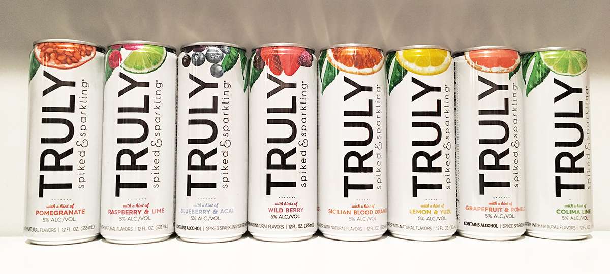
The stark contrast of the black, bold san serif font against a pure white backdrop.
The subtle hint of color in the flavor name.
The pull-tab is black while the rest of the can is silver. Why? Why not!
The burst of color provided by the awesome fruit images—which are oh so elegantly cropped at the top of the can—provide just a peek at the epic fruit flavor you are about to enjoy. You don’t need to see the whole photo, folks. This kind of purposeful cropping makes me weak in the knees!

And on the box itself. . . those GLORIOUS droplets of water!! Come on!
So. Stinking. Effortless.
This brand packaging makes me feel like I’m on the beach, the sun is out, the can is kissed with dew and I am sipping out of that beautiful black-and-white-striped straw. Why is it black and white and not some fun crazy color, you ask? Because we aren’t selling straws here. We are selling a “spiked & sparkling” fruit-flavored adult beverage. Which by the way, that tagline says it all. . . this design is ‘spiked’ with brilliant punches of design greatness and is literally ‘sparkling’ well, because, you know. . . the water droplets (see above mention).
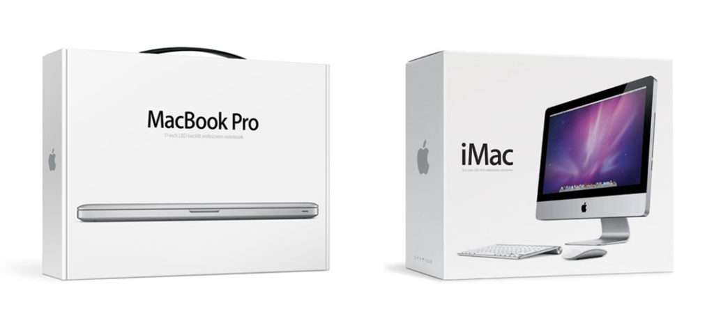
This is the kind of brand packaging that makes you glad you are a designer and sad that you didn’t design it yourself. I get the same tingly feeling when I look at some other great packaging designs that share these similar elements—Apple®, anyone?
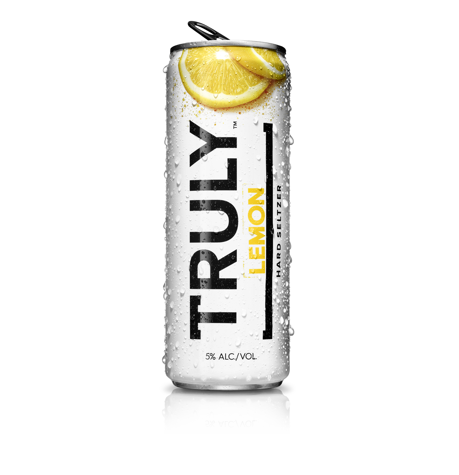
FYI. . . as I post this, I am well aware that my above visuals from my own stash are out-of-date, as the fine folks at Truly® have since updated their packaging. But seriously, just when I thought they couldn’t get any more beautiful—they went and did it again! Subtle changes that still stand the test of my current review. So. Stinking. Effortless. They took the best of the older packaging and made it better; even more simplified fruit photos and a bolder product name. That’s how you do a branding face-lift.
Can’t get enough of this packaging play-by-play?
Stay tuned for more of my ramblings about awesome brand packaging design! Inspiration is everywhere. If you’re hungry for more now and just can’t wait, go to my post about Absolut® Vodka!
If you have any questions or would like to learn more about our food marketing firm, please reach out to the NewPoint team. Interested in more food brand marketing topics?—please visit our Food for Thought page or check out NewPoint’s Patrick Nycz’s book: Moving Your Brand Up the Food Chain.