Mar 11, 2021
Duck, Duck Goose: Beautiful Beer Packaging
Beautiful Beer Packaging by Goose Island
I know, I know, another beer blog. I can’t help what inspires me!
Unlike my previous blog about Busch Light’s brand growth, I’m getting back in my lane and talking about Goose Island’s beer packaging and visuals.
A few weeks ago, I was perusing the beer aisle at the grocery store, looking for something for the weekend that was a little tastier than my usual Bud Light, but still fit my calorie budget. I’m not exactly sure what it is about the alcohol aisle, but man, do they have some good designs.
I’ve never heard of this product before, but it spoke to my heart and went into my cart. Honestly, I don’t think I even choose it; it chose me. Duck, Duck, Goose!
Can we just LOOK. AT. THIS. BEER PACKAGING:
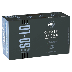
Simple.
Sleek.
Beautiful.
To-the-point.
Glorious.
You just get it. Immediately.
And, when I didn’t think it could get any better, I visited the Goose Island website to prep to write this blog. I could cry happy tears. The beer’s packaging, the cans, the website. Everything is so seamless. When did this magical branding happen? I don’t know, but this is the type of design I aspire to design, and it should be the type of design you aspire your brand to have.
I’m going to try to stop geeking out for a minute to explain why I’m so obsessed with this beer packaging.
It is simple.
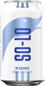 From the two-colored simple beer packaging to the name “So-Lo,” it is simple. It stood out on the shelf and I knew from the name that it was going to be low-calorie. That’s the benefit of simple beer packaging. AND, because of the high-end feel, I knew it wasn’t the typical low-calorie beer. The product was in my hands before I even knew it was an IPA. I like IPAs, but at this point, I think I may have tried it even if I didn’t.
It is consistent.
I was so pleasantly surprised when I opened the package and the can was just as clean as the box. Then I visited the website and my mind was blown. Their website feels just like their packaging. How can this be? Goose Island has lots of different beers. But they did it. They successfully streamlined all of their products to feel like one harmonious family while letting each drink shine for its unique attributes. I realize I’m getting frivolous with my words here, but I’m truly so excited about all of this. I mean, just LOOK at their beautiful line-up of cans!
It is So. Freaking. Cool.
It is the middle of winter, but I wanted to grab a 6 pack and head to the lake. Like, I would look good drinking this beer, ya know? And who doesn’t want their consumers to feel that way about their brand? Move over, White Claw; Goose Island is coming for you!
If you have any questions about how to make your beer packaging awesome and your brand cohesive, please reach out to the NewPoint team. If you are interested in more food brand marketing topics, please visit our Food for Thought page or check out NewPoint’s Patrick Nycz’s book: Moving Your Brand Up the Food Chain.

