May 18, 2021
Product Line Differentiation —Don’t Disappoint Your Customer
Packaging Gone Wrong
I was inspired [told] to write this blog about product line differentiation by fellow design-partner-in-crime, Ashley Morgan. After much scuttlebutt in the office over the contents two K-Cups in particular in our kitchenette.
I had no choice. I had to write about it.
The contenders in today’s battle are both from the Entenmann’s® brand. A well-established brand, IMHO, in the donut world. Who doesn’t love an Entenmann’s chocolate frosted donut? So, no surprise when I stumbled upon an Entenmann’s Hot Chocolate K-Cup for the first time and I said “Yes, please!”. I was told by my frequent ‘supplier’ of this enticing beverage that they were difficult to find in stores and that I would likely have to look online to purchase.
Time went on, and I forgot about them for a while, but from time to time, my heart still longed for the taste of the famous donut-makers’ hot chocolate elixir. I told “the guy in charge of supplies” a.k.a my boss, our company President, that this stuff was great. As the frequent purchaser of the steady supply office K-Cups (mostly coffee), he surprised me one day with four 10-count boxes of Entenmann’s Hot Chocolate K-Cups. YES!!!! He did a victory dance, patted himself on the back, and I said “Awesome.”
Long story short, it was not hot chocolate.
Long story long. . . read on.
A Coffee in Hot Chocolate’s Clothing
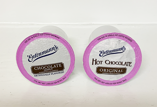
I didn’t have the heart to tell him it was, in fact, Entenmann’s Chocolate Donut Flavored Coffee, not hot chocolate. Makes sense that the famed donut-makers would have a coffee flavored for their namesake donut. Also makes sense that they would have a hot chocolate product too. What doesn’t make sense?—the packaging. It is poorly designed. Poorly might be too strong a word, but you decide.
You see, as an avid coffee purchaser, he (my boss) mistakenly saw ‘Chocolate Donut’ and assumed Hot Chocolate. Bam—Add to cart. Done. An honest mistake, I get it. I too was fooled, at first, but may have had my blinders on because I was told it was hot chocolate, read ‘Chocolate Donut’, and looked no further.
I can only assume the path that lead him to the purchase, but as I did a test search of my own, I stumbled onto the same thing he likely did: I did an Amazon search for “entenmanns hot chocolate kcups” and this is what I got. . .
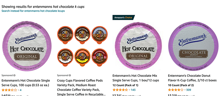
Now, yes, the REAL hot chocolate does show up first in the lineup. But, right there at the end is that little ol’ coffee cup just staring right back at you. Pretty much the same packaging, except for a few different words. Now, as previously mentioned, the boss is a coffee guy. A coffee guy looking for hot chocolate might easily mistake ‘Chocolate Donut’ for a hot chocolate product. Heck, a confirmed non-coffee drinker like myself could just as easily make that same mistake. When you’re on a mission for hot chocolate, and you see the word ‘chocolate’ where do you think your mind will go?
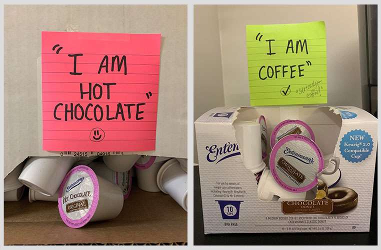
Now, back to the office scuttlebutt. . . So, a few of the coffee drinkers in the office who knew nothing of this oopsie-daisy purchase of the coffee vs. the hot chocolate, they got to looking at the boxes of (what looked like) oodles of K-Cups of hot chocolate. See, I’m not the only one! I heard some of the conversation at the end of the hall. Ashley popped in, mentioned the ongoing confusion, and told me to write a blog. She found herself explaining this to the coffee drinker and that led to this blog, and this in the office—no more confusion.
Product Line Differentiation Is Crucial
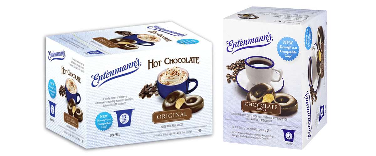
As a designer, I have some thoughts, of course! I could write a whole other blog on how to redesign these K-Cups, and the box they come in—really make them stand out from their coffee cousin. Heck, I would like to design it for them, now. Please! But I will keep it short and offer up just a few simple suggestions: change the color ring from purple to another color—any color; give the “hot chocolate” a fun, different font; take the word ‘original’ out of that same brown shape that’s used for the coffee K-Cup. There are literally so many things to make this stand out as a different product. Keep these tidbits in mind when adding options to your product line.
I grump because I care. . . and I don’t like coffee.
I care because I am passionate about design.
And I am passionate about design because the world needs clarity. And product differentiation.
Don’t make people try too hard. Heck, don’t make them try at all.
I will say, I did make the coffee, I sipped it. I didn’t like it.
If I was going to drink chocolate coffee, I would rather have a shot of coffee in my hot chocolate and not a shot of chocolate in my coffee.
If you love coffee, you might love it. But, I digress.
Now, for the sake of my point of product line differentiation, I will comment on the box designs that the K-Cups come in. And, in Entenmann’s defense, they do show a whipped-topped cup on the hot chocolate box—but, come on. . . very similar in design still! And, when you search online, you typically see the Cups image show up, not the box. Remember, these are difficult (I’ve been told) to find in stores, so your consumers are likely relying on what they see first in your online store. And, just to clarify (per our office scuttlebutt), our coffee cups came in the pretty Entenmann’s branded box, whereas the hot chocolate cups just came in a sad, bulk-purchased white box. Now, on to that review. I have nothing to say—as the photo says a lot.
Don’t Confuse Your Consumer
The point of the rambling is this—product line extensions are great. Having choices for your consumers is a win. Just make sure you are creating a brand design that is both cohesive and differentiating enough so you don’t confuse your consumers.
If you would like to learn more about how great packaging design can help your product line differentiation or about NewPoint, please reach out to the NewPoint team — interested in food marketing topics? Please visit our “Intel” page or check out my book: Moving Your Brand Up the Food Chain.

